PUBLISHING 2: Project 1 Summary Post (Corrected)
29 August 2016–27 September 2016 (Week 1–Week 5)
Gabriella Godeliva Adytanthio (0324170)
Publishing 2: Mass Communication
Project 1 Summary Post (Corrected)
13 September 2016 (Week 3) History of Print
2nd - 8th Century AD
The Emperor of China commanded that the six main classics of Confucianism carved in stone. Such knowledge in that time and age was only accessible by people with class or a position in the government. As a way to 'steal' information, commoners who have no way to obtain information otherwise would lay sheets of paper (or silk?) on the engraved slabs and rub all over it with charcoal or granite. To transfer something to another surface is basically printing.
750-768, Korea and Japan
The first printed document was the Dharani Sutra in Korea. In this time period, government and religion more often than not came hand in hand. In order to make commoners support/accept their power, religion is used to convince.
768 AD, Japan
The empress at that time commissioned a huge edition of lucky charm/prayers for pilgrims. The amount of these were millions. It's called the Hyakumantou Dharani, which translates into one million pagodas and Dharani prayers.
868 AD, China
Earliest known printed scroll dates back to the Tang Dynasty (the Diamond Sutra). It is the first time text is combined with images/illustrations. It comes in the form of a scroll, 16ft long and 1ft high. It is also the world's first printed illustrations.
10th-11th Century, China
All Confucian classics are published for officials. Buddhist and Daoist work combined, there were 5000 publications of each, a huge amount considering technology at that time. Realizing the laborious effort needed, the movable type was pioneered in the country.
11th Century
The movable type was experimented, but it was impractical because of two things: 1) there were too many Chinese characters, 2) the characters were cast to clay/ceramic, which were fragile materials.
1380, Korea
The first type foundry. Foundry, at the time, were metal casting workshops. Koreans cast their type in bronze instead of clay, making it last longer and strong to reuse.
1443, Korea
Korean invented their own alphabet, the Hangul. Coincidentally, this century, Gutenberg was also experimenting with movable type in Europe.
In the east, the market for printing was religious people, selling drawings or images of holy figures to pilgrims. In the west, however, playing cards were popular.
19 September 2016 (Week 4) The Grid
The grid is a fundamental element without which you are unable to build a strong system. The grid organizes the things (elements) inside it. Without grids, it gets messy when there are many pages or many elements involved. An example of the prominent use of the grid is in the practice of brand corporate identity, where uniformed spacing and grids are used to create a stronger brand.
We owe what we know today and how we use things today to a number of people: El Lissitsky, Jan Tschichold, Paul Penner, Moholy Nagy, and Joseph Müller-Brockmann. Each of them come from different cultural backgrounds, and different cultures have different ways to approach and solve a problem, thus leading to several different designing approaches.
Germans are very frank, no-nonsense people. This is reflected in the teachings of Bauhaus. They think of functionality, and they do not mull over spirituality or even decoration. Italians, on the other hand, oppose the utilitarianism of Germans. They're humanists. Their passion never fails to come through their work and crafts. British are aristocratic; they love elegance and class but the design shows not much functionality. Asian designs are colorful and spiritual to point of religious. Broadly speaking, Asian design does not have much order/organization.
Müller-Brockmann said, "The use of grid as an ordering system is the expression of a certain mental attitude." As a designer, you either follow or break away from the -isms. The grid is more or less the same case; it is the expression of professional ethos. You can believe or reject the grid and the structured design it creates.
The grid is used by a lot of people, including typographers, architects, photographers, exhibition designers, and many others, in order to solve visual problems. Like a building foundation, the grid holds the design up. The grid divides a two-dimensional plane into smaller fields or a three-dimensional space into smaller compartments. In a page (two-dimensional plane), margins play an important role because they determine the spaces across a publication. Other spaces in a page that the designer should be able to control is the hangline (where the body copy starts), the space between columns and the size of the columns itself, among other elements. Guidelines are made to help the designer control the spaces.
When information is presented in an orderly way that the grid creates, it is scientifically proven that people can more easily remember the contents. Think of school textbooks that are mostly filled with unorganized information and connect it to why most students don't like reading the textbooks.
Despite all the organization that the grid brings, it is not supposed to be a constraint, or even a prison. It does allow for variety/flexibility if you see the multiple combinations it can afford. These combinations, however, must be of a controlled amount in a publication to maintain coherence and continuity. It's modular: one framework for different things.
So how do you decide on a grid? Contents dictate form. Think of the nature of your content: is it heavy in copy or images? Are there any pull-quotes or subtexts? How many pictures are going to be there? Not only that, you also have to consider your target audience. A designer should be able to put oneself in the target's shoes, which is why pilot tests are important that the message is clearly absorbed even by people who know nothing about the subject matter. Remember that you are not designing for yourself, and you have to be objective in your design.
The grid helps the user experience. The grid shouldn't be flaunted. It works in the background while the contents do the talking. A good publication gives the readers a pleasant surprise with every turn of the page. The grid should be there, but you can't see it.
1) Making a book mockup. Using A3 paper, we are to create mockups for our book. We were first instructed to make three different variations of sizes to compare them with each other and see which one suits our content best. After we've decided on a specific size, we were then instructed to create a mockup of the book consisting of 9 A3 pages. The mockup was made by hand, from measuring to stapling and cutting.
I ended up choosing a nearly square size: 21 cm (width) x 22.7 cm (height).
2) van der Graaf grid. This is a step-by-step exercise done manually on an A3 paper. After that, the steps are transferred onto our formats of choice in InDesign and the ratio is recreated digitally.
Steps:
Feedback
Week 1
Week 3
Week 5
Reflections
Experience
First of all, I expected the workload to grow with every passing semester, but I didn't expect it to be this much. Another unexpected thing for me is the amount of manual work for this module in the form of weekly exercise; I thought we were just going to use InDesign, but that doesn't mean I didn't enjoy them. All in all, I was quite anxious at the beginning of the semester (as I always feel every time a new term begins), and the anxiety is made worse when we were informed of the assignments that we're going to have.
It's a new thing to be in a class of fifteen people—we've all been in the same class together before, but I think the significant increase in interaction really makes the experience different. It was much more communicative compared to last semester. Sadly, there's not much difference in terms of sharing work with each other—we occasionally show each other our progress with the assignment, but there's no real feedback-giving in the process.
Writing three-thousand-word "essay" about ourselves or something close to us also proved to be difficult for me. This project is challenging because of the amount of deciding involved. We are required to establish bits and pieces of our "visual style"—the phrase seems to be emphasized a lot across different modules this semester and it's really worrying me because I still don't know what my style is. The text that we created in the first week is going to be translated into visuals as well, which adds to the list of reasons why the text is so important and it's harder to decide what we're going to talk about. Also, when I was drawing out the illustrations, my marker started running out halfway...
In a nutshell: it's a traumatic experience so far. I would warn people to beware of semester three.
Observation
I notice that I'm being challenged in terms of self-organization. There's a bunch of work to do that are to be submitted on the same day; which one should I do first? How long will it take for me to finish it? These kinds of questions pop up frequently whenever I'm trying to sort out my priorities. As if making a priority list is not hard enough, self-discipline enters the room. I realize that I've been tempted to slack off a lot lately, and the justification for that is "to have time for myself" when really I should be finishing work. The more work I have, the more things I want to do that isn't related to work: "I have five assignments due next week—let's clean the bedroom."
Another thing that I've noticed is regarding the interaction between classmates. The number of people in one class increases, so naturally we talk to each other more. However, most of the conversations have something to do with our assignments, and there are times when it's just collective chaos—someone asks about work and the other responds (unsurely, most of the time), which leads to more questions asked and finally everyone concludes that they know nothing and it is time to freak out. I find that I am quite okay handling this kind of situation (as in not giving in to pressure) but it might make it harder for other people (although there hasn't actually been any verbal complaint so far).
I also realize that I'm acting very normally during these challenging times, which is weird... I would normally just freak out. Maybe I'm already dead inside and pasrah (placid? Resignation??). On the other hand, this untranslatable feeling leads me into just doing the work without spending too much time in deciding, which can be both good and bad: good because I don't waste time dilly-dallying and bad because what I do isn't well-planned or well thought of.
Findings
I found that the self-disciplining part plays a more crucial role compared to self-organization; if I have good self-control, I'll organize my workflow better. That said, I need to keep in mind that taking breaks are important, but everything needs to be done in moderation.
It's also good that I'm able to Keep Calm and Carry On™ instead of freaking out like I normally would. Hopefully, this kind of attitude can remain intact until the end of the semester and doesn't bring any bad side effects. It would be an exceptional achievement if I could somehow "infect" people with calmness during one of those collective chaos moments. As I mentioned, by keeping my head somewhat leveled I was able to produce a number of sketches in a relatively short time period. If only I was better at the self-control department, my performance would be even better.
Another important thing is for me to keep an eye on my health. I've been down with different minor sicknesses for more than half of the project. I can plan and organize and schedule all you want, but if I'm sick, everything that has been planned thus far will go wrong. I need to keep myself healthy so that it doesn't hinder my assignments.
Books read throughout the project:
1) Experimental Layout by Ian Noble and Russell Bestley
I consider myself lucky for finding this book. It's called "Experimental Layout", written by Ian Noble and Russell Bestley. The book itself has a nice layout, so looking at it is already one way of learning. Inside the book is also interviews with some designers who has their work featured. The title of the book tricked me into thinking that it is solely about publication design, but in fact it is not, since the written contents are discussing graphic design in general. The examples given, however, are all publications.
A particular chapter I find interesting is "form follows content". Big words are printed across the spread after the chapter page: "WHY MAKE A STUPID THING BEAUTIFUL?". Things I learned from this particular chapter:
Aside from the points above, the sample works are also something I've learned, since it is directly shows the different usages of layouts that might be a potential source of inspiration for my own book later on.
2) Basic Cover by Page One Publishing Singapore
The book I'm reading (or looking through, because they're just pictures) is called Basic Cover. It's a compilation of works for clients done by Page One Publishing Singapore. I picked this book to sort of look for inspiration and see if there's a particular style I'm leaning towards. The different styles are clearly reflected through the covers of the books, and I realize I'm able to list down clearly what makes a style different from the other. It's basic typography, layout, colors, size, the use of photographs, etc. I realize that I have to take these elements into consideration, and I'm now more aware of the elements used in the imagery that I want to create.
References
Noble, I. & Bestley, R. (2002). Experimental layout. Crans-Près-Céligny: RotoVision.
Basic cover. (2013). Singapore: Page One.
Gabriella Godeliva Adytanthio (0324170)
Publishing 2: Mass Communication
Project 1 Summary Post (Corrected)
Lecture
5 September 2016 (Week 2) Formats Throughout History
We were given a short introduction to civilization and how innovation almost always shadows technology. Technology gives birth to new opportunities that later on will affect human lives. Civilization borrows ideas from technology.
We were given a short introduction to civilization and how innovation almost always shadows technology. Technology gives birth to new opportunities that later on will affect human lives. Civilization borrows ideas from technology.
- Mesopotamia (Iran/Iraq)
The first writing system comes in the form of counting technology. Clay tablets are used and marks were made on them to keep records/numbers. This shows clearly that the bottom line of everything has always been business. In the case of the Mesopotamian civilization, clay tablets were the format to keep a record. The marks on the tables were pictographs. - Indus Valley (India)
There wasn't much record-keeping done, but there was a lot of complexity in terms of technology. This civilization is known for its advanced technology (considering their time), such as sewage/drainage systems. Their form of writing is called cuneiform, and they were inscribed on soft clay tablets. Soft clay tablets were then replaced by palm leaves. These palm leaves were tied together at the center, but the natural characteristic of the material causes this sort of record-keeping method to disintegrate faster. Not just for business, record-keeping or any sort of documentation expanded to other areas of the civilization. - Egypt
Only scribes can read and write in hieroglyphics. In this civilization (and various others, mostly in the Eastern part of the world), reading and writing are group-exclusive; only certain people can do it. Egyptians wrote on papyrus, a type of plant that grows in the area. Papyrus is layered to create some form of paper. Tomb walls are also a medium for important writings. - Han (China)
Chinese used to write vertically on bamboo strips, tied together. The first printed book was done in China in the form of a scroll: the Diamond Sutra. The print is made by wood blocks. After the discovery of this new method, the Chinese dedicate themselves to documentation (they obsess over it). However, writing extremely detailed Chinese characters in reverse on wood blocks wasn't easy, and afterward, the movable type was introduced. This is long before Gutenberg. The Chinese discovered movable type, but the ones that made it successful were the Koreans. They used bronze for their type to make them last longer. - Turkey (Western)
This civilization records things on parchment, which is made of dried animal skin. This material is too thick to turn into scrolls. This is where the book format came from. Turks refer to knowledge from previous civilizations about how to solve problems. Paper later on journeyed from east to the west through the Ottoman empire.
13 September 2016 (Week 3) History of Print
2nd - 8th Century AD
The Emperor of China commanded that the six main classics of Confucianism carved in stone. Such knowledge in that time and age was only accessible by people with class or a position in the government. As a way to 'steal' information, commoners who have no way to obtain information otherwise would lay sheets of paper (or silk?) on the engraved slabs and rub all over it with charcoal or granite. To transfer something to another surface is basically printing.
750-768, Korea and Japan
The first printed document was the Dharani Sutra in Korea. In this time period, government and religion more often than not came hand in hand. In order to make commoners support/accept their power, religion is used to convince.
768 AD, Japan
The empress at that time commissioned a huge edition of lucky charm/prayers for pilgrims. The amount of these were millions. It's called the Hyakumantou Dharani, which translates into one million pagodas and Dharani prayers.
868 AD, China
Earliest known printed scroll dates back to the Tang Dynasty (the Diamond Sutra). It is the first time text is combined with images/illustrations. It comes in the form of a scroll, 16ft long and 1ft high. It is also the world's first printed illustrations.
10th-11th Century, China
All Confucian classics are published for officials. Buddhist and Daoist work combined, there were 5000 publications of each, a huge amount considering technology at that time. Realizing the laborious effort needed, the movable type was pioneered in the country.
11th Century
The movable type was experimented, but it was impractical because of two things: 1) there were too many Chinese characters, 2) the characters were cast to clay/ceramic, which were fragile materials.
1380, Korea
The first type foundry. Foundry, at the time, were metal casting workshops. Koreans cast their type in bronze instead of clay, making it last longer and strong to reuse.
1443, Korea
Korean invented their own alphabet, the Hangul. Coincidentally, this century, Gutenberg was also experimenting with movable type in Europe.
In the east, the market for printing was religious people, selling drawings or images of holy figures to pilgrims. In the west, however, playing cards were popular.
19 September 2016 (Week 4) The Grid
The grid is a fundamental element without which you are unable to build a strong system. The grid organizes the things (elements) inside it. Without grids, it gets messy when there are many pages or many elements involved. An example of the prominent use of the grid is in the practice of brand corporate identity, where uniformed spacing and grids are used to create a stronger brand.
We owe what we know today and how we use things today to a number of people: El Lissitsky, Jan Tschichold, Paul Penner, Moholy Nagy, and Joseph Müller-Brockmann. Each of them come from different cultural backgrounds, and different cultures have different ways to approach and solve a problem, thus leading to several different designing approaches.
Germans are very frank, no-nonsense people. This is reflected in the teachings of Bauhaus. They think of functionality, and they do not mull over spirituality or even decoration. Italians, on the other hand, oppose the utilitarianism of Germans. They're humanists. Their passion never fails to come through their work and crafts. British are aristocratic; they love elegance and class but the design shows not much functionality. Asian designs are colorful and spiritual to point of religious. Broadly speaking, Asian design does not have much order/organization.
Müller-Brockmann said, "The use of grid as an ordering system is the expression of a certain mental attitude." As a designer, you either follow or break away from the -isms. The grid is more or less the same case; it is the expression of professional ethos. You can believe or reject the grid and the structured design it creates.
The grid is used by a lot of people, including typographers, architects, photographers, exhibition designers, and many others, in order to solve visual problems. Like a building foundation, the grid holds the design up. The grid divides a two-dimensional plane into smaller fields or a three-dimensional space into smaller compartments. In a page (two-dimensional plane), margins play an important role because they determine the spaces across a publication. Other spaces in a page that the designer should be able to control is the hangline (where the body copy starts), the space between columns and the size of the columns itself, among other elements. Guidelines are made to help the designer control the spaces.
When information is presented in an orderly way that the grid creates, it is scientifically proven that people can more easily remember the contents. Think of school textbooks that are mostly filled with unorganized information and connect it to why most students don't like reading the textbooks.
Despite all the organization that the grid brings, it is not supposed to be a constraint, or even a prison. It does allow for variety/flexibility if you see the multiple combinations it can afford. These combinations, however, must be of a controlled amount in a publication to maintain coherence and continuity. It's modular: one framework for different things.
So how do you decide on a grid? Contents dictate form. Think of the nature of your content: is it heavy in copy or images? Are there any pull-quotes or subtexts? How many pictures are going to be there? Not only that, you also have to consider your target audience. A designer should be able to put oneself in the target's shoes, which is why pilot tests are important that the message is clearly absorbed even by people who know nothing about the subject matter. Remember that you are not designing for yourself, and you have to be objective in your design.
The grid helps the user experience. The grid shouldn't be flaunted. It works in the background while the contents do the talking. A good publication gives the readers a pleasant surprise with every turn of the page. The grid should be there, but you can't see it.
Instructions
Exercises
Exercises Individual Work (20%)
The Brief
Exercises.
Duration of Assignment
8 Weeks (Briefing on Week 1)
Deadline
Week 9 (24 Oct 2016)
Description
Throughout the beginning and the middle of the semester, exercises will be prescribed at various phases of the module. These exercises will aid and benefit you in your quest to gain theoretical and practical knowledge in book design that will inform you whilst completing various phases of the modules projects.
All exercises prescribed are to be completed and documented (labeled, clean, clear & concise) in your ePortfolio and Hardcopy portfolio respectively.
The exercises are as follows:
1) Text formatting
2) Mock-up making
3) Signature folding systems (8+8=16)
4) Classical Grid structure
5) Form & Movement Exercises (Thumbnail)
• 1 Colour
• 2 Colour
• 2 Colours + Image
• Colour + Image + Text
Requirements
To complete and to showcase mastery in the exercises prescribed in its various forms over the 13-week period. This process is repeated for all 8 weeks. The work is compiled logically and chronologically in an A3 clear sheet folder and documented on the students’ e-portfolio.
Submission
1. Exercises to be documented in an A3 Clear Sheet folder, logically and chronologically. The works must be labelled and dated.
2. Eportfolio posts for every week labelled and dated, with images captured well and in good light in so that the works are pleasing to the eye and legible.
Objectives
1. To develop students theoretical understanding via practical means.
2. To develop students practical skills.
3. To develop students sense in the use of space.
4. To develop students ability to arrange different elements attractively within a grid system.1) Making a book mockup. Using A3 paper, we are to create mockups for our book. We were first instructed to make three different variations of sizes to compare them with each other and see which one suits our content best. After we've decided on a specific size, we were then instructed to create a mockup of the book consisting of 9 A3 pages. The mockup was made by hand, from measuring to stapling and cutting.
I ended up choosing a nearly square size: 21 cm (width) x 22.7 cm (height).
 |
| Figure 1 . 16 x 24 cm, 21 x 22.7 cm, 21 x 21 cm |
 |
| Figure 2 . Page |
 |
| Figure 2a. Pen for scale |
 |
| Figure 3 . Spread |
2) van der Graaf grid. This is a step-by-step exercise done manually on an A3 paper. After that, the steps are transferred onto our formats of choice in InDesign and the ratio is recreated digitally.
Steps:
- Precisely fold the A3 paper into 2, resulting in two pages of A4. Draw a line if needed.
- Create two diagonal lines from the bottom left of the A3 paper to the top right (referred to as Line A) and bottom right to the top left (Line B).
- Connect the bottom left point to the top right point of the left side of the A3 (Line C), and the bottom right point with the top left point of the right side of the A3 (Line D).
- There should be an intersection between Line A and Line D at the right side of the A3. From that intersecting point, draw a 90-degree straight line to the top of the paper (Line AD).
- There should be another intersection between Line B and Line C. From that intersecting point, draw a line connecting to the end of Line AD (creating line BC)
 |
| Figure 4a. Manual van der Graaf grid |
 |
| Figure 4b. Digital van der Graaf grid |
3) Creating a mockup using signature folding system. You'll need a sheet of A3 paper. Here are the steps:
4) Analyzing a grid system of an existing layout. We were asked to go to the library and browse through books to find three interesting layouts. We made copies of the spreads, and in class, we were instructed to try and figure out the system that is used for the layout. This required us to measure the pages to find out the margins, also the number and size of columns existing on one page. Through this exercise, we were pushed to put ourselves in the shoes of the designer that worked on the layout and see how they work.
5) Creating movement in spreads using rectangular forms. This exercise is digitally done using InDesign. We were asked to create a 16-page document in the size of our book. The margins and columns are for us to decide, as well as the horizontal guides. Then, we were instructed to accordingly fill the pages/spreads with colored rectangles—Mr. Vinod encouraged us to experiment because this is the perfect time to do so. The rectangular forms in each page/spread have to have some kind of connection or transition with the next ones.
Instructions Project 1
- Fold the A3 paper in half, left to right, creating an A4-sized shape.
- Again, fold that into half, this time from bottom to top.
- Fold it again in half from left to right.
- Number each page, double-sided. There should be a total of 16 pages.
- Staple-bind the mockup.
- Cut off the sides of the book to disattach the folds.
- The result should be an A6-sized "book"
 |
| Figure 5a. Folds |
 |
| Figure 5b. Page numbering after fold |
 |
| Figure 5c. Mockup result |
4) Analyzing a grid system of an existing layout. We were asked to go to the library and browse through books to find three interesting layouts. We made copies of the spreads, and in class, we were instructed to try and figure out the system that is used for the layout. This required us to measure the pages to find out the margins, also the number and size of columns existing on one page. Through this exercise, we were pushed to put ourselves in the shoes of the designer that worked on the layout and see how they work.
 |
| Figure 6 . A poorly photocopied spread |
5) Creating movement in spreads using rectangular forms. This exercise is digitally done using InDesign. We were asked to create a 16-page document in the size of our book. The margins and columns are for us to decide, as well as the horizontal guides. Then, we were instructed to accordingly fill the pages/spreads with colored rectangles—Mr. Vinod encouraged us to experiment because this is the perfect time to do so. The rectangular forms in each page/spread have to have some kind of connection or transition with the next ones.
 |
| Figure 7 . Movement using forms (single color) |
 |
| Figure 8 . Movement using forms (single color) |
 |
| Figure 9 . Movement using forms (double color) |
 |
| Figure 9b. Movement using forms (double color) |
Instructions Project 1
The Book. (Part 1: Content Generating)
Duration of Assignment
4 Weeks (Briefing on Week 1)
DEADLINE
Week 5 (25 Apr, 2016)
Description
In this project you will be asked to create and design a book of 32 pages that is smaller than A4 but bigger than A5. Your task will be to:
Requirements
The student must document the above progression in their eportfolio and A3 hardcopy portfolio. The results of the two phases must be collated and presented in the sample format shown in class. The 3000 words is to be formatted and submitted on A4 paper, at 9pt Helvetica, 11pt leading, consisting of all textual information of the book from front cover to back cover. A thumbnail printout of all 16 visuals as shown in the sample produced in class.
Submission
All gathered information (failures, successes, epiphanies, sketches, visual research, printouts, websites, images, charts, etc.) documented chronologically in the A3 Clear Sheet folder. The works must be labelled and dated.
All gathered information (failures, successes, epiphanies, sketches, visual research, printouts, websites, images, charts, etc.) documented logically and chronologically in the eportfolio for every week, for the duration of the project.
Typed content of 3000 words, formatted on A4 paper. (Left Aligned, 9pt Helvetica, 11pt leading, consisting of all textual information from front to back cover).
All 16 visuals placed in InDesign, using the predetermined page size and printed out in colour in a thumbnail printout.
Objectives
Duration of Assignment
4 Weeks (Briefing on Week 1)
DEADLINE
Week 5 (25 Apr, 2016)
Description
In this project you will be asked to create and design a book of 32 pages that is smaller than A4 but bigger than A5. Your task will be to:
- Write 3000 words (English/Malay) on any subject that you are familiar with, for example: yourself, your family, someone who inspires you, your hometown, or an experience or an idea/belief that you feel strongly about, etc. The text content must be divided into 3 chapters minimum, it must also have 3/4/5 subtexts (sidebars) and one caption per chapter. You have 1 week for this.
- Identify 16 areas in your written text for visualization, you may use any medium that is suitable for your topic/direction, for example: illustration, photography or mix-media. You have 3 weeks for this (after completing your 3000 words).
Requirements
The student must document the above progression in their eportfolio and A3 hardcopy portfolio. The results of the two phases must be collated and presented in the sample format shown in class. The 3000 words is to be formatted and submitted on A4 paper, at 9pt Helvetica, 11pt leading, consisting of all textual information of the book from front cover to back cover. A thumbnail printout of all 16 visuals as shown in the sample produced in class.
Submission
All gathered information (failures, successes, epiphanies, sketches, visual research, printouts, websites, images, charts, etc.) documented chronologically in the A3 Clear Sheet folder. The works must be labelled and dated.
All gathered information (failures, successes, epiphanies, sketches, visual research, printouts, websites, images, charts, etc.) documented logically and chronologically in the eportfolio for every week, for the duration of the project.
Typed content of 3000 words, formatted on A4 paper. (Left Aligned, 9pt Helvetica, 11pt leading, consisting of all textual information from front to back cover).
All 16 visuals placed in InDesign, using the predetermined page size and printed out in colour in a thumbnail printout.
Objectives
- To develop students ability to generate own content.
- To develop intimacy with content generated.
- To develop students ability to communicate visually.
 |
| Figure 10 . Illustration set 27/9 |
Feedback
Week 1
Gabby the embeded file doesn't seem to display correctly. A link to the PDF uploaded online unto your G'Drive might help. We need to work out what when wrong with the display — Kah Lok seems to have a similar problem as well. The "fear of failing" is indeed an issue everyone in this part of the world has inherited from a system that is propagated in this part of the world. It is a huge stumbling block, one that we must overcome, as failure is a prerequiste to success.Week 2 (none)
Week 3
Week 4 (none)
Progress is good, but still needs to speed up. The illustrations are quite detailed. Colour palatte needs to be worked out.
Week 5
Illustrations are detailed. However colors seem overly consistent, might require to introduce a second colour to differentiate. Text is formatted properly, with all necessary requirements.
Reflections
Experience
First of all, I expected the workload to grow with every passing semester, but I didn't expect it to be this much. Another unexpected thing for me is the amount of manual work for this module in the form of weekly exercise; I thought we were just going to use InDesign, but that doesn't mean I didn't enjoy them. All in all, I was quite anxious at the beginning of the semester (as I always feel every time a new term begins), and the anxiety is made worse when we were informed of the assignments that we're going to have.
It's a new thing to be in a class of fifteen people—we've all been in the same class together before, but I think the significant increase in interaction really makes the experience different. It was much more communicative compared to last semester. Sadly, there's not much difference in terms of sharing work with each other—we occasionally show each other our progress with the assignment, but there's no real feedback-giving in the process.
Writing three-thousand-word "essay" about ourselves or something close to us also proved to be difficult for me. This project is challenging because of the amount of deciding involved. We are required to establish bits and pieces of our "visual style"—the phrase seems to be emphasized a lot across different modules this semester and it's really worrying me because I still don't know what my style is. The text that we created in the first week is going to be translated into visuals as well, which adds to the list of reasons why the text is so important and it's harder to decide what we're going to talk about. Also, when I was drawing out the illustrations, my marker started running out halfway...
In a nutshell: it's a traumatic experience so far. I would warn people to beware of semester three.
Observation
I notice that I'm being challenged in terms of self-organization. There's a bunch of work to do that are to be submitted on the same day; which one should I do first? How long will it take for me to finish it? These kinds of questions pop up frequently whenever I'm trying to sort out my priorities. As if making a priority list is not hard enough, self-discipline enters the room. I realize that I've been tempted to slack off a lot lately, and the justification for that is "to have time for myself" when really I should be finishing work. The more work I have, the more things I want to do that isn't related to work: "I have five assignments due next week—let's clean the bedroom."
Another thing that I've noticed is regarding the interaction between classmates. The number of people in one class increases, so naturally we talk to each other more. However, most of the conversations have something to do with our assignments, and there are times when it's just collective chaos—someone asks about work and the other responds (unsurely, most of the time), which leads to more questions asked and finally everyone concludes that they know nothing and it is time to freak out. I find that I am quite okay handling this kind of situation (as in not giving in to pressure) but it might make it harder for other people (although there hasn't actually been any verbal complaint so far).
I also realize that I'm acting very normally during these challenging times, which is weird... I would normally just freak out. Maybe I'm already dead inside and pasrah (placid? Resignation??). On the other hand, this untranslatable feeling leads me into just doing the work without spending too much time in deciding, which can be both good and bad: good because I don't waste time dilly-dallying and bad because what I do isn't well-planned or well thought of.
Findings
I found that the self-disciplining part plays a more crucial role compared to self-organization; if I have good self-control, I'll organize my workflow better. That said, I need to keep in mind that taking breaks are important, but everything needs to be done in moderation.
It's also good that I'm able to Keep Calm and Carry On™ instead of freaking out like I normally would. Hopefully, this kind of attitude can remain intact until the end of the semester and doesn't bring any bad side effects. It would be an exceptional achievement if I could somehow "infect" people with calmness during one of those collective chaos moments. As I mentioned, by keeping my head somewhat leveled I was able to produce a number of sketches in a relatively short time period. If only I was better at the self-control department, my performance would be even better.
Another important thing is for me to keep an eye on my health. I've been down with different minor sicknesses for more than half of the project. I can plan and organize and schedule all you want, but if I'm sick, everything that has been planned thus far will go wrong. I need to keep myself healthy so that it doesn't hinder my assignments.
Books read throughout the project:
1) Experimental Layout by Ian Noble and Russell Bestley
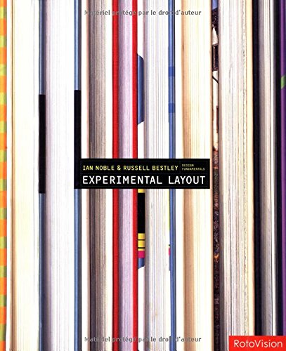 |
| Figure 11 . Experimental Layout by Ian Noble and Russell Bestley |
I consider myself lucky for finding this book. It's called "Experimental Layout", written by Ian Noble and Russell Bestley. The book itself has a nice layout, so looking at it is already one way of learning. Inside the book is also interviews with some designers who has their work featured. The title of the book tricked me into thinking that it is solely about publication design, but in fact it is not, since the written contents are discussing graphic design in general. The examples given, however, are all publications.
A particular chapter I find interesting is "form follows content". Big words are printed across the spread after the chapter page: "WHY MAKE A STUPID THING BEAUTIFUL?". Things I learned from this particular chapter:
- Excerpt from the book: "When accepting a brief from the client, the graphic designer is always involved in some level of negotiation." At this point the designer talks to the client about their demands, which most of the time are against what the designer thinks is best, and that is why negotiations are necessary.
- The different roles of graphic designers in relation to their client. They can be someone who facilitates the client, solving problems with aesthetic consideration geared towards the brief. Some people might also view them as tools that should follow what the client wants to the dot.
- Designers might be viewed as "playing a lesser role in the creation of the message or the intention of the work". However, Peter Willberg says that designers "are also creating something worthwhile". The designer's own motive plays a part in the brief negotiation.
- Designers have shifted from people who just respond to a brief into people who can intervene, making it more like a collaboration than an obligation.
Aside from the points above, the sample works are also something I've learned, since it is directly shows the different usages of layouts that might be a potential source of inspiration for my own book later on.
2) Basic Cover by Page One Publishing Singapore
 |
| Figure 12 . Basic Cover by Page One Publishing |
 |
| Figure 13 . Grid Systems in Graphic Design by Josef Müller-Brockmann |
3) Grid Systems in Graphic Design by Josef Müller-Brockmann
After flipping through the pages at first glance it looks like this book covers a range of different things that has to do with the grid, including type and pictures. However, as I was looking through the book, there is a section called "Margin proportions", and the author has provided a number of different examples of margins applied on a page.
What made me stop and read was one of the examples that looks more or less like mine: the top, left, and right margins are of equal length. The author notes that although the grid area is well placed on the page in regard to depth, "margins of the same size can never result in an interesting page design; they always create an impression of indecision and dullness."
It's as if the author can read minds just by looking at margins. I have to admit that I was a little indecisive when I applied the margin on my page, but does that mean that it is necessary for me to change my margin according to Müller-Brockmann's "well-proportioned margin"? It doesn't change the fact that the author's example of a well-proportioned margin does look better, so maybe I'll end up changing my margins anyway (so as to not sink the text/image into the gutter).
Now I haven't finished reading the whole book yet, but I believe there is some important information that can serve as guides when I'm preparing the book layout. Even the layout of this book itself is something interesting; Müller-Brockmann himself did the layout and the German/Swiss way of thinking that he holds on to really is reflected on the pages. The grid system is very visible (especially compared to the spread I did in one of the exercises) and it doesn't look like Müller-Brockmann has ever gone one single millimeter out of the column. The pictures perfectly fit the grid.
Technically this kind of orderly layout makes it very easy for the readers to digest the information presented, but personally, it can get a little bit boring after looking at it for some time. I recently stumbled upon a video which briefly mentions the effect fonts have on learning, and apparently according to the video, fonts that are easier to read (e.g. Times New Roman or Arial) tend to make us pay less attention to it because it is easily digested (this explanation is a horribly simplified version of the video).
Maybe Müller-Brockmann's layout appears a bit boring to me after some time is because it is so effective that it makes me lazy to read the contents carefully? The video that I watched made me question the balance that design has power over between making readers comfortable, but not so much that they don't focus at all.
References
Noble, I. & Bestley, R. (2002). Experimental layout. Crans-Près-Céligny: RotoVision.
Basic cover. (2013). Singapore: Page One.
Müller-Brockmann, J. (1981). Grid systems in graphic design. Niederteufen: Verlag Arthur Niggli.
Picture credits
Figure 1~10, Figure 12
Personal documentation
Figure 11
(2016). Retrieved from https://images-na.ssl-images-amazon.com/images/I/51amXKn9iXL.jpg
Figure 13
Raster Systeme by Josef Müller-Brockmann. (2016). Retrieved from https://s-media-cache-ak0.pinimg.com/564x/9a/92/c0/9a92c0cd86c5e6c6167050073c06130f.jpg
Picture credits
Figure 1~10, Figure 12
Personal documentation
Figure 11
(2016). Retrieved from https://images-na.ssl-images-amazon.com/images/I/51amXKn9iXL.jpg
Raster Systeme by Josef Müller-Brockmann. (2016). Retrieved from https://s-media-cache-ak0.pinimg.com/564x/9a/92/c0/9a92c0cd86c5e6c6167050073c06130f.jpg