PUBLISHING 2: Project 2 Summary Post
3 October 2016–25 October 2016 (Week 6–Week 9)
Gabriella Godeliva Adytanthio (0324170)
Publishing 2: Mass Communication
Project 2 Summary Post
Lecture
4 October 2016 (Week 6) Typography Redux
Typography is the art of arranging and composing text. As graphic designers, we're going to deal not only with visuals but also with text, as text is an inseparable aspect of human lives. In this lecture, we are re-introduced to the different types of glyphs that together make text, as well as the typographical conventions that come along with how to handle them.
Characters in a typeface, not including upper case/lower case:
10 October 2016 (Week 7) Elements
"What are the elements that make up a book?"
Instructions
Progress
First, we did sample grids according to the format of our book. I had Raster Systeme to guide me in adjusting the ideal margins so that the area isn't floating or too stiff. Below are pictures of the grid options I have created.
Later on, we were asked to pick three typefaces (or three typeface combinations) for the text in our book. Below are the typefaces that I was initially interested in. Keep in mind that the text has not been adjusted according to the chosen grid in the following pictures.
At the end, I chose to use Montserrat (not the Alternate family) combined with Gill Sans.
We also need to determine a point of reference (can be more than one) in order to visualize the look and feel of our book.
Submission(s)
Black-and-white mockup, 36 pages including front and back cover:
Book thumbnail in color; several changes after printing the mockup:
Feedback
Week 6
Reflections
Experience
"I Don't Even Know What I'm Doing" turns out to be the perfect book title because that sums up exactly how I feel. While I make progress with the passing of time and complete whatever I am supposed to complete, it seems that I have no idea about what I'm doing—I mean, I know that in this project I'm solidifying my book by arranging the contents on the pages, but as I move the text around and adjust pictures, I don't know what those movements mean (I hope I'm making sense up to this point).
Basically creating the layout for the book is a blurry experience for me. I'd say that it's getting harder for me to figure out what my opinions are as well. Picking a typeface is, as usual, a hard task for me, but finding a point of reference is even harder. Fortunately, everything turned out well (in my opinion, at least), but regrettably, I have no recollection of my thoughts as I made my decisions: why this typeface or why this kind of layout.
Observation
As I've talked about, I realize that my thoughts are rather unclear. I can't seem to reassure myself that what I have done is okay, but I am able to carry on regardless with the help of my lecturer's feedback. Things seem to slip my mind more than usual. I also realize that I'm constantly switching between "I've done a lot of work, I deserve some rest" and "What if I haven't done enough?", which can be mentally tiring at times.
At one point, some of my classmates weren't attending classes and that got me a little bit worried. I assume that it's because we're going through more or less the same thing in classes. We're showing each other our work as usual, which is nice, but hopefully the new E5.15 set-up can help us create a more involved learning atmosphere.
Findings
The blurriness of my thoughts is probably because of the way I spread myself to do assignments. I always split my work for different subjects periodically, so the variety and pace might have caused this blurriness I'm experiencing. Because of that, I'm unable to precisely recall my emotions or thoughts and write them down in this post. I "posted" weekly updates before the deadline for the Project 1 Summary Post, and that helps me remember what we did and how I felt, but I skipped doing that for this project because I was so busy juggling with my five other subjects as well.
When I said it's increasingly hard for me to figure out my opinions, I think that's not quite accurate. I may already have an opinion of my own, but under these circumstances, I don't think I can do anything about it. This happens to me when I look at my illustrations. I remember the feedback I got from my lecturer about how the colors might be too constant, but it may work depending on how I arrange them in my book. Mr. Vinod hasn't given me any comments about them ever since (probably because it's time to focus on the book itself), but I find myself doubting the visuals. Despite that, I haven't got any time to fix everything (plus I need time to figure out what I need to fix), so I just let it go, even if it unsettles me a bit. Maybe I just spent too much time working on the illustrations and looking at it in the spreads... which reminds me of how Mr. Vinod said we need to cultivate the ability to look at our work objectively. How am I supposed to look at it objectively when I've spent months staring at it until I can see it when I close my eyes?
I suppose I need to find a way to clear the fog in my mind, and I usually resort to entertainment for that. But as I mentioned previously, I'm constantly switching between "I've done a lot of work, I deserve some rest" and "What if I haven't done enough?", so at the end of the day, I can't really decide if I worked hard enough to deserve a movie. But, to steal a quote from our lecture, this too shall pass.
Books read throughout the project:
References
Picture credits
Figure 1 ~ 10, 14 ~ 20
Personal documentation
Figure 11
Lone Wolf magazine, Volume 12. (n.d.). [image] Available at: https://s-media-cache-ak0.pinimg.com/564x/f4/f7/cc/f4f7ccd20f8ad50d6a9c940180c04f06.jpg [Accessed 16 Oct. 2016].
Figure 12
Kinfolk magazine. (n.d.). [image] Available at: https://s-media-cache-ak0.pinimg.com/564x/ab/90/77/ab9077f34869e1a5b6fe5d9c6cffaa53.jpg [Accessed 16 Oct. 2016].
Figure 13
The New Sylva by Gabriel Hemery. (2014). [image] Available at: https://s-media-cache-ak0.pinimg.com/564x/27/85/96/278596a605871046a4b61ee1d25cbab5.jpg [Accessed 16 Oct. 2016].
Figure 21
Mastering Materials, Bindings, & Finishes: The Art of Creative Production. (n.d.). [image] Available at: http://d.gr-assets.com/books/1328754503l/3126100.jpg [Accessed 11 Nov. 2016].
Figure 22
Ready to Print. (n.d.). [image] Available at: https://d262ilb51hltx0.cloudfront.net/max/800/1*lDHjQEYF3RjrkQiSOh_wZQ.jpeg [Accessed 11 Nov. 2016].
Figure 23
Trapping. (n.d.). [image] Available at: https://www.prepressure.com/images/design_trapping.gif [Accessed 11 Nov. 2016].
Gabriella Godeliva Adytanthio (0324170)
Publishing 2: Mass Communication
Project 2 Summary Post
Lecture
4 October 2016 (Week 6) Typography Redux
Typography is the art of arranging and composing text. As graphic designers, we're going to deal not only with visuals but also with text, as text is an inseparable aspect of human lives. In this lecture, we are re-introduced to the different types of glyphs that together make text, as well as the typographical conventions that come along with how to handle them.
Characters in a typeface, not including upper case/lower case:
- Small caps — capital letters that share the same x-height as lower case characters. Designers should be careful of fake small caps (upper case in a smaller size)
- Numerals
- Fractions
- Ligatures — two or more characters joined into one glyph. Could be to better the spacing between the letters, or used as pronunciation guide/representing specific sounds (e.g. æ)
- Punctuation
- Mathematical signs
- Symbols
- Non-aligning figures — the numbers in this typeface, Georgia, are considered non-aligning figures because they don't share the same baseline to sit on: 1234567890. This is also referred to as old style numerals.
There are various things concerning text that a designer should pay attention to. These things are:
- Weights — bold, black, light, extra light, etc.
- Indents — usually applied at the beginning of a paragraph. If it is done in this way, there should be no paragraph spacing.
- Line breaks
- Legibility — a lot of the aspects of typography that are going to be brought up in the next points affect legibility. The reader should be able to perfectly read the text.
- Styles — this includes subscript and superscript, baseline shifts, strikethroughs, etc.
- Text scaling — don't squeeze or stretch text.
- Outlining — outlining to a certain extent disrupts the letterforms.
- Type size, line length, and line spacing — generally one line consists of 50-65 characters. If the line length is too long, people would lose the motivation to read, while if it's too short, their reading flow is disturbed. Also, to begin working on a publication, a designer must first pick a typeface, and then determine the size, line length, and leading (in that particular order).
- Widows and orphans — a line or word that is left alone.
- Kerning — reduce space between letters.
- Tracking — add and reduce space between letters. Adding space between letters is called letter spacing.
- Alignments — important to know: if a paragraph is justified, use indents. If it is left aligned, do not use indents.
- Paragraph spacing
- Paragraph indents
- Hyphen, en-dash, em-dash — these are examples of their correct usages: hyphens for phone numbers 016-2004-723; en-dash indicating a period of time 21 Oct – 1 Nov; em-dash acting as parentheses or to separate a clause from the main sentence.
- Shift-enter!
- Drop cap — never use them beyond three lines.
- Quotation marks — compare ",' to “,”.
Everything concerning these conventions in typography can be found in the Chicago Manual of Style.
10 October 2016 (Week 7) Elements
"What are the elements that make up a book?"
Basically speaking, there are three elements that designers juggle with from page to page: type, color, and visuals. Other key elements include the grid, which is determined before putting in the main three elements in the publication, and the paper or material that the publication is going to be printed on.
Do not be trapped with predictability. Designers have to constantly question themselves: is it surprising enough? However, consistency needs to be upheld, and while the grid helps, it does not do all the work. We must also consider the way we start our text: where it begins on a page. Although designers might find it hard, they need to maintain a certain objectivity towards their work, and that is a skill they have to eventually cultivate.
There are different ways to make variation: the way you present your visuals, the way you juggle your text and visuals, and the way you combine all three (text, visuals, and color). Gestalt — it is a German concept of perceiving something as a whole instead of in parts. This concept can be practiced in form and movement exercises involving pictures, texts, and form.
Be aware that too much variation will cause only confusion on the reader's part. There should be a set number of variation and the usage is to be rotated throughout the publication, in which you have made a consistency out of a set of variation.
In designing a publication, a point of reference plays an important role because it sets the tone of your publication. You do not have to mimic the exact same grid or text alignment used in your reference, but you can extract different arrangements of elements and apply it accordingly to your work.
"You can never be too prepared for something."
Experience has a way to reduce tension and workload, as you're already familiar with the working process. Keep in mind that you will never have a full grasp of something until experiencing, but even people who have experience still do not have that full grasp.
In conclusion:
- Do not be predictable. Surprise readers with every turn of the page.
- Variation and consistency are to be kept at the same time.
- The grid is used logically, but also in a compositionally attractive manner
- You might not be able to apply what you learn through these exercises right away, but in time you'll understand its purpose.
Instructions
The Brief
The Book. (Part 2: Layout & Final Mock-up)
The Book. (Part 2: Layout & Final Mock-up)
Duration of Assignment 4 Weeks (Briefing on week 5)
Deadline Week 9 (25 Oct, 2016)
Description
After developing content (text and visuals) the next stage is to determine the format (size and binding method), and an appropriate & attractive layout based on a suitable grid system, choice of font/s and use of colour.
- Due to time constraints the binding method shall be predetermined to be staple binding (saddle binding). The book is of 32 pages, which is smaller than A4 and bigger than A5. However should you wish to try a different binding method you may do so with the permission of your lecturer.
- You will need to adapt a suitable grid system, choose a fitting font and create an attractive layout in InDesign.
- Your choice of colour must compliment your visuals and play a role that is supportive but also create dynamism where needed. It is advised to limit the use of colour, as it could be distracting.
- You need to determine your paper type, for cover as well as inside pages. A visit to the paper factory Hiap Moh or Conqueror is advised.
The end result will be an actual size mock-up of the book with finishing that is of good standard.
Requirements
The student must utilize the accumulated knowledge from the exercises, lectures and from their own reading (library books and online sources) to guide them and inform them in their decisions.
The student must document the process (sketches, layouts, trial and errors) in their e-porfolio and hardcopy portfolio. The student will be expected to submit the final mock-up in the hardcopy portfolio and the softcopy PDF uploaded or embedded unto the eportfolio. Create a separate folder in your Google Drive and store all files, artefacts, project submissions, etc. here.
Ensure all items are logically and chronologically ordered, labelled and dated.
Submission
- All gathered information (failures, successes, epiphanies, sketches, visual research, printouts, websites, images, charts, etc.) documented logically and chronologically in the A3 Clear Sheet hardcopy portfolio. The works labelled and dated.
- All gathered information (failures, successes, epiphanies, sketches, visual research, printouts, websites, images, charts, etc.) documented logically and chronologically in the eportfolio for the duration of the quiz.
- Pictures of the final book mock-up, softcopy PDF uploaded or embedded unto the eportfolio. Label it as final so that it is clear that this is the final version.
- Final book mock-up in actual size and on the selected paper along with a complete thumbnail print out of all the pages.
Objectives
- To develop students ability to arrange various elements attractively in a book.
- To develop students ability to create a suitable grid system that allows them flexibility.
- To develop students ability to integrate text and visuals attractively.
- To develop students ability to maintain a consistent identity with acceptable variation.
- To develop students ability to use color appropriately; supportive or dynamic.
Progress
First, we did sample grids according to the format of our book. I had Raster Systeme to guide me in adjusting the ideal margins so that the area isn't floating or too stiff. Below are pictures of the grid options I have created.
 |
| Figure 1 . Grid option 1 |
 |
| Figure 2 . Grid option 2 |
 |
| Figure 3 . Grid option 3 |
 |
| Figure 4 . Grid option 4 |
 |
| Figure 5 . The chosen one |
Later on, we were asked to pick three typefaces (or three typeface combinations) for the text in our book. Below are the typefaces that I was initially interested in. Keep in mind that the text has not been adjusted according to the chosen grid in the following pictures.
 |
| Figure 6 . Abril type sample |
 |
| Figure 7 . Adobe Garamond Pro type sample |
 |
| Figure 8 . Gill Sans type sample |
 |
| Figure 9 . Abril (heading), Gill Sans (body) |
 |
| Figure 10 . Montserrat alt (heading), Adobe Garamond Pro (body) |
At the end, I chose to use Montserrat (not the Alternate family) combined with Gill Sans.
We also need to determine a point of reference (can be more than one) in order to visualize the look and feel of our book.
 |
| Figure 11 . Lone Wolf magazine |
 |
| Figure 12 . Kinfolk magazine |
I decided that the book "The New Sylva" is the closest I envisioned my book to look like, and it ended up as my main point of reference.
 |
| Figure 13 . Spread from "The New Sylva" 1 |
 |
| Figure 14 . Spread from "The New Sylva" 2 |
 |
| Figure 14 . Spread from "The New Sylva" 3 |
Submission(s)
Black-and-white mockup, 36 pages including front and back cover:
 |
| Figure 14 . Mockup cover |
 |
| Figure 15 . Mockup back cover |
 |
| Figure 16 . Mockup spread |
Book thumbnail in color; several changes after printing the mockup:
 |
| Figure 17 . Cover and back cover before edited |
 |
| Figure 18 . Inside back to page 16-17 |
 |
| Figure 19 . Page 18-19 to the end |
 |
| Figure 20 . Final book |
Feedback
Week 6
(Given in class) Mr. Vinod brought up some points in our e-portfolio post for Project 1, and the class decided on the format of the post together before fixing it on the spot. We were also given comments about how some of our photos, particularly of the exercises, were not presentable, and that we should spend more effort in Photoshopping it to look better.Week 7
The body text had two different line lengths, and this isn't a norm, and isnt advisible. The chapter and heading needs more thought, the positioning and size can bee relooked at. leading and point size of sub-text and body-text need to be consistent, if sub text is diff font, match the x-height with the body text and maintain the leading.Week 8
Needs to continue to her second chapter, presently 1st chapter looks good. (2nd class: All chapter seem to have been completed. Colour and BW thumbnail of complete pages need to be viewed and mockups need to be printed.Week 9
Some processes in the exercises are missing (diff sizes of the mock up). One lecture is missing, I think its the grid lecture. The hand drawn van der graf grid is not doumented. The second 2 colour form and movement exxercise is not there. Mention the week of the feedback. Rest seems fine.
Reflections
Experience
"I Don't Even Know What I'm Doing" turns out to be the perfect book title because that sums up exactly how I feel. While I make progress with the passing of time and complete whatever I am supposed to complete, it seems that I have no idea about what I'm doing—I mean, I know that in this project I'm solidifying my book by arranging the contents on the pages, but as I move the text around and adjust pictures, I don't know what those movements mean (I hope I'm making sense up to this point).
Basically creating the layout for the book is a blurry experience for me. I'd say that it's getting harder for me to figure out what my opinions are as well. Picking a typeface is, as usual, a hard task for me, but finding a point of reference is even harder. Fortunately, everything turned out well (in my opinion, at least), but regrettably, I have no recollection of my thoughts as I made my decisions: why this typeface or why this kind of layout.
Observation
As I've talked about, I realize that my thoughts are rather unclear. I can't seem to reassure myself that what I have done is okay, but I am able to carry on regardless with the help of my lecturer's feedback. Things seem to slip my mind more than usual. I also realize that I'm constantly switching between "I've done a lot of work, I deserve some rest" and "What if I haven't done enough?", which can be mentally tiring at times.
At one point, some of my classmates weren't attending classes and that got me a little bit worried. I assume that it's because we're going through more or less the same thing in classes. We're showing each other our work as usual, which is nice, but hopefully the new E5.15 set-up can help us create a more involved learning atmosphere.
Findings
The blurriness of my thoughts is probably because of the way I spread myself to do assignments. I always split my work for different subjects periodically, so the variety and pace might have caused this blurriness I'm experiencing. Because of that, I'm unable to precisely recall my emotions or thoughts and write them down in this post. I "posted" weekly updates before the deadline for the Project 1 Summary Post, and that helps me remember what we did and how I felt, but I skipped doing that for this project because I was so busy juggling with my five other subjects as well.
When I said it's increasingly hard for me to figure out my opinions, I think that's not quite accurate. I may already have an opinion of my own, but under these circumstances, I don't think I can do anything about it. This happens to me when I look at my illustrations. I remember the feedback I got from my lecturer about how the colors might be too constant, but it may work depending on how I arrange them in my book. Mr. Vinod hasn't given me any comments about them ever since (probably because it's time to focus on the book itself), but I find myself doubting the visuals. Despite that, I haven't got any time to fix everything (plus I need time to figure out what I need to fix), so I just let it go, even if it unsettles me a bit. Maybe I just spent too much time working on the illustrations and looking at it in the spreads... which reminds me of how Mr. Vinod said we need to cultivate the ability to look at our work objectively. How am I supposed to look at it objectively when I've spent months staring at it until I can see it when I close my eyes?
I suppose I need to find a way to clear the fog in my mind, and I usually resort to entertainment for that. But as I mentioned previously, I'm constantly switching between "I've done a lot of work, I deserve some rest" and "What if I haven't done enough?", so at the end of the day, I can't really decide if I worked hard enough to deserve a movie. But, to steal a quote from our lecture, this too shall pass.
Books read throughout the project:
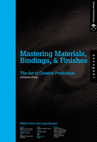
- Mastering Materials, Bindings, & Finishes: The Art of Creative Production by Catharine Fishel
Figure 21 . Mastering Materials, Bindings, & Finishes
One fascinating thing about this book is, true to its title, it gives out all information about the book's material, from the types of paper they use for different parts of the book, the spine, binding techniques, etc. And they put it on the cover, too. As a publication, it is unique to the touch because of the cover material, and it is also different because of the size of the cover spread that is larger than the content paper. I assume this is the thing that they address as "extent" in the description.
In this book is a collection of attention-grabbing printed designs that uses specific methods or materials for their printing to further support the design—without good consideration of these two things, the design will fail no matter how good it stands alone. As someone who is not well-versed in this side of publication design due to not only limited experience but also printing materials and places around me, this book is very eye-opening, and a lot of times I find myself realizing that I don't even know the things mentioned in the book exists.
Again, a quote that has always been drilled into our head is present in the book: "the medium is the message". This does not only apply to Advertising as we've learned in the previous semester, but also to publishing, where you have the freedom to pick a material that is best for the product and the design itself.
Besides providing tips and insight on printing using different materials (paper-based surface, plastic, cloth, wood, leather, transparent surfaces, and metal), this book gives examples of how different design groups or designers fulfill their brief using unique material or techniques. There's also a chapter dedicated to discuss special inks and coatings, such as metallic ink, glow-in-the-dark ink, or ink that changes color depending on temperature (thermochromatic ink), which are all quite cool and must cost a lot. Here's a list of materials, binding methods, and usages of ink which I find quite unusual, but inspirational nonetheless:
- Old wallpaper
- Old book covers
- Recycled felt
- An invitation on plexiglass (acryclic glass)
- Glow-in-the-dark postcards
- Rope from sail rigging as binding, cover from embroidered sailcloth. Appropriately, the client is Queensway Bay.
- Small, die-cut pages in a book which resembles the shape of a door: when the reader opens the cut portion, they are rewarded with more information, much like a children's storybook. It's an annual report.
- Cinnamon sticks on the cover of a book for a nonprofit culinary and cooking organization.
- A real piece of carpet in an invitation for Target Commercial Interiors.
- An invitation for the opening of a new office for a lighting company that can be assembled into a mini table lamp. It glows in the dark, too.
There are truly so many things to learn just from this book, considering the detailed explanations they have from different aspects of a publication: material, binding, ink types, cutting methods, etc. Will have to invest more time to read through it more thoroughly when I have the chance.This book is published by Page One, Singapore. - Ready to Print: A Handbook for Media Designers by Kristina Nickel

Figure 22 . Ready to Print
Yet another book that is nice to the touch. I personally like the material of the cover and the fact that the cover has rounded edges.
This book, published by Gestalten (Germany), covers seven main areas. To name them:- Paper
- Printing technology
- Composition and typography
- Trapping
- Color
- Image editing
- PDF
Paper is one of the most used material for publications. There is a huge amount of variety in types of paper, from the difference in texture and color to weight and finish. There are several factors in papermaking that makes one type of paper different from another. A machine's direction determines the paper grain, producing either short grain or long grain; and the paper's finish affects the appearance and feel of the paper: think of glazed paper, embossed paper, coated or uncoated paper. Paper weight is measured in the metric system using gsm (gram per square meter)—the heavier the grammage the thicker the paper, until it might not be considered paper any more. Paper volume is the sheet thickness in relation to its weight. For example, a 100 gsm machine finished book paper with a 1.5 fold volume has a thickness of 0.15 mm. There are also different paper grades and paperboard grades. Some example of paper grades that you might recognize are:- Banknote paper
- Bible paper (lightweight printing paper)
- Copying paper
- Parchment paper
- Recycled paper
- Tissue paper
There are also different types of printing processes that can determine the outcome of your publication. In general, it is divided according to the shape of the form amd the counterpressure elements of the printing unit: both printing unit and form can be flat-flat or round-round, or it can be round-flat (flat printing form against round printing unit). Letterpress is one of the oldest printing methods. Since it involves high pressure, the shadow of the print can be seen from the reverse side, and if you look closely, the letterforms have halos around them. Gravure printing is the opposite of letterpress, where the elements are recessed in copper-laminated printing cylinder. To spot a result of gravure printing, look for the sawtooth effect surrounding a letterform (jagged edges). Other printing processes are: offset printing, screen printing, digital proofing, electrophotography, inkjet printing, and many more, due to the advancement of current technology.Trapping is a means to ensure absolute precision of a printed material. Without trapping, there can sometimes be a white gap in multicolor printing. The degree of trapping depends on registration tolerance value in the printing method considering the type of paper that is used. Note that white gaps in light colors might be less visible, so trapping is not a must in such cases. Traps can be done in Adobe inDesign.
Figure 23 . Trapping (not from the book) The many technical explanations regarding softwares makes this book a valuable one for reference. You can find instructions as well as helpful charts and tables for different things, from paper sizes to color conversion.
References
Fishel, C. (2007). Mastering materials, bindings, & finishes. 1st ed. Gloucester, Mass.: Rockport Publishers.
Nickel, K. (2011). Ready to print. 1st ed. Berlin: Gestalten Verlag.
Picture credits
Figure 1 ~ 10, 14 ~ 20
Personal documentation
Figure 11
Lone Wolf magazine, Volume 12. (n.d.). [image] Available at: https://s-media-cache-ak0.pinimg.com/564x/f4/f7/cc/f4f7ccd20f8ad50d6a9c940180c04f06.jpg [Accessed 16 Oct. 2016].
Figure 12
Kinfolk magazine. (n.d.). [image] Available at: https://s-media-cache-ak0.pinimg.com/564x/ab/90/77/ab9077f34869e1a5b6fe5d9c6cffaa53.jpg [Accessed 16 Oct. 2016].
Figure 13
The New Sylva by Gabriel Hemery. (2014). [image] Available at: https://s-media-cache-ak0.pinimg.com/564x/27/85/96/278596a605871046a4b61ee1d25cbab5.jpg [Accessed 16 Oct. 2016].
Figure 21
Mastering Materials, Bindings, & Finishes: The Art of Creative Production. (n.d.). [image] Available at: http://d.gr-assets.com/books/1328754503l/3126100.jpg [Accessed 11 Nov. 2016].
Figure 22
Ready to Print. (n.d.). [image] Available at: https://d262ilb51hltx0.cloudfront.net/max/800/1*lDHjQEYF3RjrkQiSOh_wZQ.jpeg [Accessed 11 Nov. 2016].
Figure 23
Trapping. (n.d.). [image] Available at: https://www.prepressure.com/images/design_trapping.gif [Accessed 11 Nov. 2016].