ADVERTISING: Week 11
14th June 2016 (Week 11)
Gabriella Godeliva Adytanthio (0324170)
Advertising Principles & Practice
Project 4: Art Direction
Lecture
None
Instructions
Project 4 brief here
Research
Progress
I have made a change in the visual aspect of the ad. The background image, which was the crumpled bed sheets last week, is now red satin. The color adds more passion into the ad.
I also encountered a lot of difficulty in choosing the typeface.
Most of the time I'm also unsure if this is the style that I want to go with. I figure it's a working ad that does its job but it looks somewhat lacking aesthetically.
I told Mr. Vinod about my doubts on the style and showed him some other styles I tried to explore in hopes that one or two might be closer to the attractive side.
At last the picture above is the style that we agreed on. I prefer this to the one last week because it attracts more attention. The aspect that I should keep in all my ads is the thin space between the letters and the edge of the ad. Feedback from Mr. Vinod can be found below.
I tried out Din Schift, a typeface suggested by Mr. Vinod, but my untrained eyes see very little differences between my initial typeface (Bebas Neue) and Din.
Feedback
Specific Feedback
Things to do with the newly-styled ad:
Reflection
Experience
Not much have changed from last week.
Observation
I realize that making decisions is becoming increasingly hard for me (as if it's not already hard in the first place). There are so many things that I have to consider, and time is not exactly what I have right now, which adds to the pressure of making a decision. I just hope that even with whatever constraints I have I can still have good judgement. I also noticed that recently I have been feeling that my work is crap. I don't know why, but in most subjects I find my work to be very unattractive compared to my peers/other people in general. This has caused me to be 1) very lazy to do work and 2) picking on myself. I find myself mocking my work and just all-in-all telling myself that I suck, especially compared to other people. However, I was reassured that it's just a phase (hopefully) and that everybody has been there before.
Findings
The writer of the book so generously gave twenty pointers for people to start thinking. The following is a transcription (?) from the book itself:
With so many new methods at our disposal, the search for remarkable unconventional communication solutions and ideas has become wild and chaotic. For some, the multitude of opportunities can have a paralyzing effect, so here are 20 pointers to help you begin exploring the vast landscape of possibilities.
As my early research has proven, the product is thin. The only part of the SMP/USP I cannot determine whether it is as promised or not is the sensitive part. However, the logic is that if the condom is thin, it would naturally have the sensitivity that it promises. So the product can do what it promises.
Taking into consideration the country of the campaign's release, which is Malaysia, there is little chance you can show off a 3-dimensional condom shape without getting into a little bit of trouble. The packaging of the condom is quite alright to make 3D, though. The condom may be quite... unique in the sensations they come with (smell, texture, etc.).
For ambient advertising, I thought of putting the condoms at places where people usually have (public) sex, but then the book says to put it in unexpected places which would make it more surprising. I thought of putting condoms in places where people usually do the do because then they would spot the condom and use it—that's like promoting them to use the condom and practice safe sex, so it doubles as a social responsibility kind of thing too. However, now that I think of it, doing so might have higher chances of exposure and usage, but the brand might not be memorable enough because it is placed in expected places. (Plus with the heat of the moment when two people are doing it? I don't think the brand will register) When the condom is placed in unexpected places, it will stick stronger to the audience's memory, while at the same time instead of having them use it, the goal can just be the person taking the condom home.
References
Himpe, T. (2008). Advertising is dead - long live advertising!. London: Thames & Hudson.
Picture credits
Figure 6 — Advertising is Dead: Long Live Advertising!. (2016). Retrieved from http://ecx.images-amazon.com/images/I/51YoqZt3kpL._SX258_BO1,204,203,200_.jpg
Gabriella Godeliva Adytanthio (0324170)
Advertising Principles & Practice
Project 4: Art Direction
Lecture
None
Instructions
Project 4 brief here
Research
Progress
I have made a change in the visual aspect of the ad. The background image, which was the crumpled bed sheets last week, is now red satin. The color adds more passion into the ad.
 |
| Figure 1 — Comparison; left is recent |
 |
| Figure 2 — Typeface exploration |
Most of the time I'm also unsure if this is the style that I want to go with. I figure it's a working ad that does its job but it looks somewhat lacking aesthetically.
 |
| Figure 3 — Style exploration |
 |
| Figure 4 — Final style |
 |
| Figure 5 — Bebas Neue vs. Din Schift |
Feedback
Specific Feedback
Things to do with the newly-styled ad:
- Try around more typefaces
- Fix the drop shadow
- Kerning
- Add a human element in the background (hand/leg) to make it more obvious that it is about sex (?)
Significant progress since the last contact wasn't visible. You seem to be stuck. The only remedy for that is exposure; books (all sorts) etc. This is not the time to wallow in doubt. Grab the bull by its horns.
Reflection
Experience
Not much have changed from last week.
Observation
I realize that making decisions is becoming increasingly hard for me (as if it's not already hard in the first place). There are so many things that I have to consider, and time is not exactly what I have right now, which adds to the pressure of making a decision. I just hope that even with whatever constraints I have I can still have good judgement. I also noticed that recently I have been feeling that my work is crap. I don't know why, but in most subjects I find my work to be very unattractive compared to my peers/other people in general. This has caused me to be 1) very lazy to do work and 2) picking on myself. I find myself mocking my work and just all-in-all telling myself that I suck, especially compared to other people. However, I was reassured that it's just a phase (hopefully) and that everybody has been there before.
Findings
If you think of someone’s good qualities as the umeboshi (pickled plum) in an onigiri (Japanese rice ball), it’s as if their qualities are stuck to their back! People around the world are like onigiri. Everyone has an umeboshi with a different shape and color and flavor. But because it’s stuck on their back, they might not be able to see their umeboshi. Maybe the reason people get jealous of each other, is because they can see so clearly the umeboshi on other people’s backs.
—"Fruits Basket"
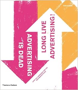 |
| Figure — Advertising is Dead Long Live Advertising |
With so many new methods at our disposal, the search for remarkable unconventional communication solutions and ideas has become wild and chaotic. For some, the multitude of opportunities can have a paralyzing effect, so here are 20 pointers to help you begin exploring the vast landscape of possibilities.
- Can you do what your brand promises?
- Can you demonstrate or visualize or product three-dimensionally?
- Can you create sensory experiences around your product or brand?
- Be creative with the appearance—form, shape, colour, size, name, logo—of your product or brand.
- When you have an idea for a traditional piece of advertising—such as a print ad or a television commercial—develop that idea one stage further and take it along the non-conventional route.
- Use traditional media channels in ways they have not been used before.
- Create the ideal setting in which your product or brand is experienced.
- Where would be the most surprising place for your product or brand to appear?
- Find things—objects, places, television programs, films—that are associated with your product or brand. Find ways to make connections.
- Play tricks on your audience.
(10/20)
I'll try to "answer" or reflect as much as possible on these pointers in relation to my ad campaign in hopes of gaining inspiration for ambient advertising. (I wished I read this book during sketching!)
As my early research has proven, the product is thin. The only part of the SMP/USP I cannot determine whether it is as promised or not is the sensitive part. However, the logic is that if the condom is thin, it would naturally have the sensitivity that it promises. So the product can do what it promises.
Taking into consideration the country of the campaign's release, which is Malaysia, there is little chance you can show off a 3-dimensional condom shape without getting into a little bit of trouble. The packaging of the condom is quite alright to make 3D, though. The condom may be quite... unique in the sensations they come with (smell, texture, etc.).
For ambient advertising, I thought of putting the condoms at places where people usually have (public) sex, but then the book says to put it in unexpected places which would make it more surprising. I thought of putting condoms in places where people usually do the do because then they would spot the condom and use it—that's like promoting them to use the condom and practice safe sex, so it doubles as a social responsibility kind of thing too. However, now that I think of it, doing so might have higher chances of exposure and usage, but the brand might not be memorable enough because it is placed in expected places. (Plus with the heat of the moment when two people are doing it? I don't think the brand will register) When the condom is placed in unexpected places, it will stick stronger to the audience's memory, while at the same time instead of having them use it, the goal can just be the person taking the condom home.
References
Himpe, T. (2008). Advertising is dead - long live advertising!. London: Thames & Hudson.
Picture credits
Figure 6 — Advertising is Dead: Long Live Advertising!. (2016). Retrieved from http://ecx.images-amazon.com/images/I/51YoqZt3kpL._SX258_BO1,204,203,200_.jpg